Contents
- Inline Text Overview
- Elements and Appearance of Inline Text
- Placeholder Text Overview
- Accessibility Factors
- Additional Resources
Inline Text Overview
Inline text is a lightweight method of providing instructional text on a page, generally to help users input data. It is static, immediately visible to the user, and doesn't require user action to invoke it.
- Use this pattern to provide brief, explanatory instructions for performing a task, or to give example formats for users to follow when entering data.
- This pattern differs from Contextual Help on Demand in that it is generally more prominent on the page, has a lower character limit, and users don't perform an action to see it.
Elements and Appearance of Inline Text
Inline text appears either persistently beneath the input or select component or inside an input component field as placeholder text.
Static Help Text
The following examples show static inline instructional text beneath the UI component.

Inline text may appear visually styled beneath a UI component as well.

Use inline text when:
- The use of placeholder text is unsupported or sub-optimal.
- Providing a small amount of assistance is critical to user success (such as showing the correct date format to use).
- Infrequent visitors to the page may benefit from some simple reminders.
-
Adequate help can be provided in 250 characters or less.
- If your inline text is not brief, use Contextual Help on Demand.
Placeholder Text Overview
Placeholder text is text displayed in the input field before the user types a value. It disappears when the user starts typing in the field. Usability tests consistently show that placeholder text in form fields depresses user performance more than helps it. However, there are cases where placeholder text is not only useful, but also more elegant than inline text.
Placeholder text is supported as an HTML5 web form input field attribute.
Placeholder Text Use Cases
The Oracle Alta UI permits use of placeholder text only in the following strict use cases:
- As instructional text - identical to inline text
- As a prompt.
The following lists the appropriate use of placeholder text as instructional text:
- Use placeholder text as instructional text in editing scenarios only.
- Use it to demonstrate the input format to use, for example, DD/MM/YYYY.
- Use placeholder text that fits within the given length of the input text field.
- Ensure the placeholder text will also fit within the input text field when the text is translated.
- Use placeholder text in combination with a standard prompt.
- Never present an actual default value as placeholder text.
Placeholder text as instructional text must be short and precise. It appears with frequently-used and familiar text fields, such as date, email address, description, and phone number. The user should never feel challenged to recall what the instructional text was before typing commenced.
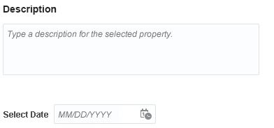
Below is an example of placeholder text used as instructional text in a description field and a select date field.

The following lists the appropriate use of placeholder text as a prompt.
- Use with a standalone input field (such as search or upload field) when an appropriately descriptive button, such as Upload or Search, is adjacent to the field.
- Use placeholder text that fits within the given length of the input text field.
- Ensure the placeholder text will also fit within the input text field when the text is translated.
- Avoid using it redundantly with another prompt, for example, First Name [First Name].
- Use in de facto industry standard formats, such as:
- A sign in page's user name and password fields.
- Segmented phone number fields where there is a group prompt.


Accessibility Factors
Although HTML5-compliant browsers support placeholder text, the browsers' default font color doesn't meet the 4.5:1 contrast ratio required for accessibility. It is strongly recommended that teams modify the CSS rule for the default placeholder text to use a different font color. In addition, set the font style to italic; this helps users distinguish placeholder text from a default data value.
Changing the default HTML5 font color and style will also insure Success Criteria 3.3.2. Additionally, use the Title attribute to identify form fields that use placeholder text as prompts to screen readers. Oracle JET and ADF development frameworks either address these issues by default, or provide a style class to apply to placeholder text used as prompts. The placeholder text font color #737373 is acceptable for this purpose.
Additional Resources
Demos: