Contents
Overview
A dialog is a common and well-known UI pattern. For browsers there are two types: popup and window. The window dialog is described briefly here, but this pattern's focus is the popup dialog.
A popup dialog is an extension of the calling page and is dependent upon the calling page in every way because it is a part of it. As such, popup dialogs have the following characteristics:
- Popup dialogs are transient. The user opens a dialog to perform one or more actions and then closes the dialog.
- Popup dialogs are constrained within the browser window boundaries of the calling page
- Users may resize a dialog but not minimize or maximize it
- Popup dialogs do not have window management controls.
A window dialog is actually a secondary browser window, and operates independently from the calling page. Because it is a browser window, it has its own native window management controls (Minimize, Maximize, Close) in a title bar provided by the OS. It is popular for use cases such as a chat window because:
- It can persist beyond the session of the calling page
- It can position outside of the window chrome of the calling page
- It can be minimized or maximized.
Elements and Appearance
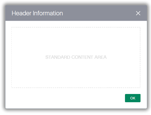
All Alta UI popup dialogs have the following characteristics:
- Gray colored region across the top
- An optional close icon (X) right-aligned within the colored region
- Dialog-specific content lies below the colored region in the Content Area
- Action buttons anchor to the lower right corner of the dialog
- Optionally, one of the buttons may serve as a Call-to-Action button.

The following is an example of a typical popup dialog. It contains a standard button (OK) and a close icon (X).

- Dialog width is set by the breadth of the content in the Content Area
- The height of a dialog is set by the length of its content
- The top colored region also serves as an ample drag "handle" location.
- Optional features of a dialog are:
- A user may resize a dialog manually by dragging any of the four borders or corners
- A user may drag a dialog when the mouse pointer changes to the move cursor.
Historically, when a dialog called another dialog, that was referred to as "cascading". Cascading dialogs would slightly overlap, which would allow the user to see both the called and calling dialog. Presenting cascading dialogs in this fashion worked well on the desktop but not very well on mobile devices.
Because Alta UI Browser Patterns are designed as mobile-friendly, Alta UI dialogs do not cascade with slightly overlapping popups. When an Alta UI dialog calls another dialog, the called dialog anchors directly over the calling dialog. The "cascading" Alta UI popup dialogs have the following characteristics:
- When the Cancel or Close button of a called dialog is clicked, navigation returns to the calling dialog
- When the optional Close icon (X) is clicked, navigation returns to the calling dialog.
Additional Resources
Demos: