Contents
Overview
Designing with visual content is an important aspect of the Oracle Alta UI. The use of color, icons, and typographical techniques is emphasized for added polish and visual design quality. These elements also have a usability purpose — to focus attention on priority information that requires user action.
Color is often used in conjunction with other visual attributes to draw user attention. It is critical for both user performance and accessibility to use two or more visual attributes to draw user attention to priority information. The practice of using multiple visual attributes to emphasize priority information in the UI is implementing a pattern called managing by exception.
- The manage by exception pattern serves two important functions: it draws user attention to a specific visual element in an already visually-rich page, and presents the user with a means to take immediate and direct action.
Components and data in the Oracle Alta UI already have their own color attributes (for example, text, content containers, and graphs), so care and consistency is required to properly execute the managing by exception UI pattern. If the pattern is misapplied, then managing by exception can become a distraction to users and actually obstruct the information that users need to see.
Guiding Principles
Managing by exception uses color and other visual attributes to accentuate the highest priority items on the page — not to decorate the UI. Data becomes a priority when it represents a value outside of an acceptable range. Calling attention to that fact allows users to more easily "manage the exceptions." For example, an ERP application might use a particular color to highlight the names of employees whose performance is out of an acceptable range, or employees who are high performers, but also a high "flight risk" from the company.
Color is a constant when emphasizing priority information to manage by exception.
- This pattern recommends using alert colors for capturing the user's attention.
-
Color cannot serve as the only signal for an out-of-range value, for accessibility and user performance reasons. Therefore, size, symbol, or some other visual attribute must be used in combination with color.
- For example, display a value that is out of range by using a larger font, along with a color.
- The choice of an attribute other than color depends on the UI and the specific use cases of your cloud service.
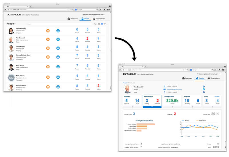
In the following image, values that are out of an acceptable range are accentuated by making them larger while also using an alert color (in this case, red). All other values receive the same neutral color and consistent size.

Note that all other elements on the page also have color (for example, icons, avatars, and content containers), and that fonts may vary in size. However, they are normalized to present similar types of information consistently, and thus remain distinct from priority information. Design teams must make sure that every instance of an icon, value, or content container does not feature a different, apparently random, color or size.
call to Action
After alerting the user to a high priority item, call the user to action. Make the out-of-range value interactive by allowing the user to touch, tap, or click onto it to take immediate action directly related to the value. When it makes sense, leverage the Oracle Alta UI principle of content navigation to accomplish this. With content navigation, the call to action is to click, tap, or touch the out-of-range value to navigate the user to a page where further action is available.
In the following image, the call to action requires the user to tap the red "2" — using content navigation to obtain more detail and applicable actions on a subsequent page.

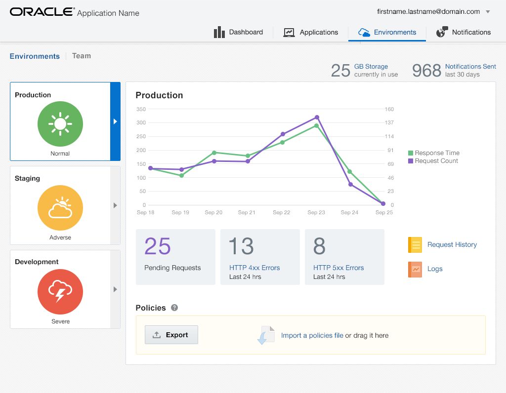
There are occasions when the call to action is best articulated by chrome navigation, such as a button. In the following example, there are three InfoTiles, each calling attention to different levels of severity. The one requiring immediate attention has a badge showing the the highest alert color next to the infoTile icon with an associated symbol, and in this case, a label that reads "severe."

The above example utilizes visual content with attributes of color (for example text, content container, and a graph) which do not distract from the attention requested by the Development InfoTile.
Call to Action Button
Another common method is using an actual call to action button. This is a contemporary technique in which a button is highlighted by color and size distinct from the default enabled state. In the example illustration below, it is the OK button.
The call to action button is most often a submit control. While other commit controls may exist simultaneously on the page as well, the call to action button represents the primary action the user performs to conclude the task -- affirmatively. Thus, its effectiveness is due to its exclusivity on a given page. Since the goal behind the manage by exception pattern is to increase user productivity, featuring more than one call to action button on the page would slow users' response as they work to discern which button to push. For this reason, only one call to action button per page or dialog is preferred.

Not all pages and dialogs require a call to action button. To maximize the effectiveness of the call to action button technique, the following heuristic is given.
Call to Action Button Heuristic
- User is expected to submit a single affirmative action more than 80% of the time.
- An inadvertent negative action (e.g., Cancel, Exit, End) is costly. For example terminates a data intensive workflow.
- The primacy of any other necessary UI control is not contested by the presence of the call to action button (e.g., it does not create confusion or hesitation for the user as to which action(s) to perform first).
The call to action button is not necessarily a substitute for a button that has input focus on page load. For example, in a wizard step where the most likely option is to accept the defaults. The Next button may have initial focus such that pressing the <Enter> key advances the wizard. The Next button may have focus highlight (e.g., a focus ring) but not necessarily call to action visual treatment. In the following example, the An input button is in the default enabled state. The A submit button is also in the enabled state but with a focus ring to indicate that it will accept the <Enter> key. Neither necessarily requires the call to action visual treatment.
