Contents
- Overview
- Oracle Alta UI Responsive Design Principles
- Devices and Display Widths
- Elements of a Responsive Design Page
- Responsive Partition Patterns
- Blocks
- Component Re-articulations
- Sample Responsive Designs
- Additional Resources
Overview
Responsive design presents a system of web page layouts that alternate to fit within different browser display widths. Responsive design is achieved through a combination of fluid grids, flexible fonts and images, and media queries that conditionally present a variety of alternative layouts based on the browser display width.
Each layout is based on a different UI design, and each design is targeted for a discreet browser display width (for example, 320px , 480px, 768px, 1024px, and 1280px). These targeted display widths roughly map to the browser display widths of common devices: phone, tablet, and desktop monitor. Each targeted display width is called a break point.
Oracle Alta UI Responsive Design Principles
The Oracle Alta UI page layout characteristics and mobile-first design principles are conducive to responsive design. They form the foundation upon which responsive design techniques are applied. Key aspects are summarized as follows:
- Design for the narrowest browser viewport first.
- This is a critical mobile-first design technique
- Use a flowing page layout.
- Set the maximum page display width your cloud service will support.
- When a page is displayed in a browser width greater than its designed maximum page display width, left and right margins of equal width would appear.
- Reposition and/or re-articulate major partitions of the page, making certain to maintain core content in immediate view.
- Avoid content disparity.
- Use list view, grid, row block, or column drop/select as datagrid formats to handle browser display-width transitions.
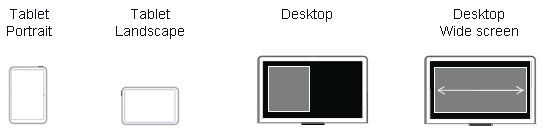
Devices and Display Widths
A responsive design is really a system of discreet page layouts, even though on a desktop, a web page designed as responsive appears to flow from one layout to another when the browser is resized. Layout shifts are apparent at specific browser display widths, called break points. These are the browser display widths at which page layouts become distinctly different from each other. Between those break points, fluid grids proportionally expand or contract the layout horizontally.
Oracle Alta UI targets a limited number of break points; these are enumerated as follows for the 4:3 ratio. The ratio gives deference to mobile displays. Each targeted display width shown below maps to a device type and display orientation.
- 320 px: phone, portrait orientation
- 480 px: phone, landscape orientation
- 768 px: tablet, portrait orientation
- 1024 px: tablet and desktop, landscape orientation
- 1280 px: desktop monitor
- 1440 px: wide desktop
The default maximum page display width assumed by the Oracle Alta UI is 1440px among the following device types and display orientations.
Disable Browser magnification
When the display width of a browser changes, the fonts and images within the page can scale to maintain an aspect ratio. For example, a web page designed to display on a desktop monitor at a width of 1024 px would appear very small to the user on a phone at that same aspect ratio or CSS pixel width. If this is allowed to occur, then a responsive design layout will not change with changes in browser display width. That is, the page display width would never effectively change because the CSS pixel width never changes.
To overcome this behavior the following meta tag specification is required.
<meta name="viewport" content="width=device-width", initial-scale=1.0, maximum-scale=1.0; user-scalable=0; />
where:
- width states to the browser how wide the page is at 100% zoom.
- Responsive designs should always specify width equal to the display width.
- initial-scale overrides the behavior of some devices to auto-scale the page to match screen width of the device.
- This auto scaling is most noticeable on auto-rotation, when the override is not in place.
- With this override, scrollbars will appear if the page is too wide for the screen versus scaling the page down. When the page is narrower than the browser display width, blank space appears on the left and right margins. This is the recommended behavior.
- user-scalable is used to avoid an inadvertent activation of scaling caused by stray finger drags (that is, manual zoom).
Elements of a Responsive Design Page
Responsive design page patterns are composed of partitions, blocks, and components.
Partitions are the major divisions of a page — referred to in legacy Oracle Fusion designs as columns: two-column layouts, three-column layouts, and so forth; however, the term "partition" is less confusing than is "column." Whereas columns may refer to equally aligned vertical segments within a grid (fixed or fluid), partitions map specifically to areas or landmarks where a page design specifies the location of various content that the user will see. In responsive design, partitions are defined by divs. Divs can span any number of grid columns.
Blocks are used to describe how one or more components contained within a partition are laid out as a unit. One or more blocks may nest within a partition.
A component is a UI display (such as a chart, graph, text box, or header) or a control element (such as a tab, menu, link, or button). For Oracle Alta UI purposes, both display and control elements are regarded as components.
Following are responsive design patterns for partitions, blocks, and re-articulated components, along with recommended combinations of each.
Responsive Partition Patterns
Two principle partition patterns are recommended, which produce a total of six different page layouts relative to browser display width. These two partition patterns assume the typical Oracle Alta UI page layout.
- Off Canvas: three page layouts
- Reposition: three page layouts
Off-Canvas
The Off-Canvas partition pattern incorporates the use of a drawer. Instead of exclusive use of the reposition technique to shift content on the page (that is, the canvas) as the display width narrows or widens, the Off-Canvas technique repositions content into or out of drawers, respectively. The following UI practices are key to the effective use of the Off-Canvas technique.
- Only peripheral or ancillary content is placed in a drawer as browser display width narrows. .
- Core content is always on canvas, regardless of display width of a page and is always present and visible to the user; it is never within a drawer.
- As the browser display width widens, off canvas content is repositioned onto the page.
- The order in which peripheral or ancillary content content is repositioned into or out of a drawer, as well as the browser display width at which the repositioning occurs, is a design choice. The illustration given below gives priority to the left drawer content (most often navigation controls) at the desktop browser display width.
Content Disparity
It is critical that content that is presented "off canvas" (in a drawer, for instance), is positioned in the same relative location and orientation when it repositions onto the canvas. Otherwise, content disparity can occur. Content disparity is the removal or large spatial displacement of content from one responsive layout to the next. Users can become annoyed by content disparity; it erodes the user's sense of control and creates an unpredictable UI.
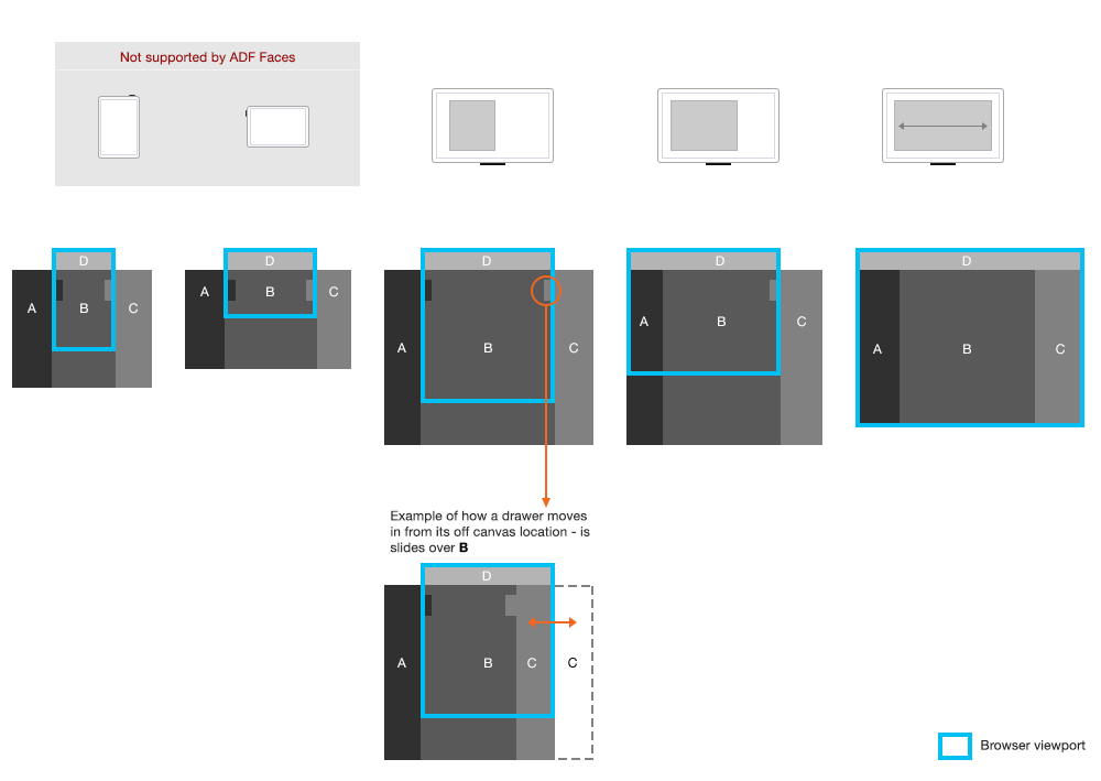
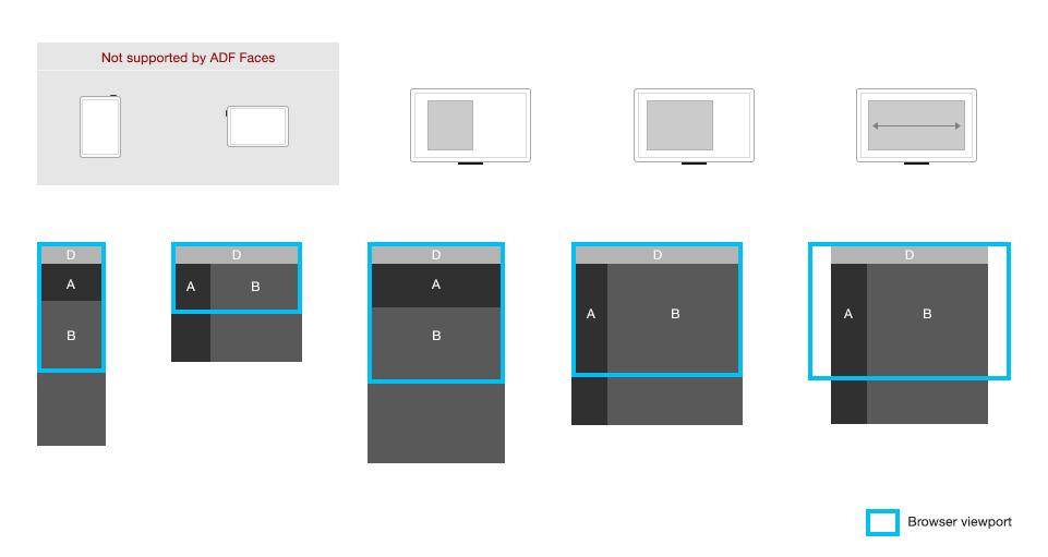
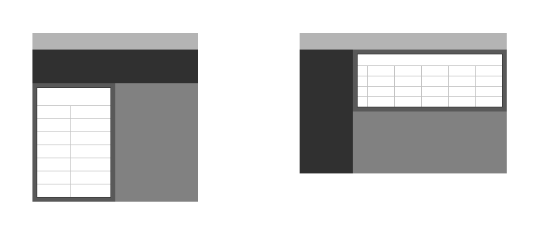
Three-Partition Patterns (Off-Canvas)
In the example below, the page has three partitions — a typical Oracle Alta UI page layout.
- The leftmost partition of the page may contain chrome navigation controls.
- The center partition contains core content central to completing the task, which is why it has the largest partition of the page.
- The rightmost partition contains ancillary content.
There are three distinct page layouts for off-canvas patterns, and each is triggered by a break point.
The following image gives examples of off-canvas partitions repositioning to on-canvas partitions as the browser display width widens from a phone portrait orientation to wide desktop landscape orientation. The top row of the illustration shows browser displays in portrait and landscape orientations, respectively. The bottom row of the illustration shows the matching page layouts.
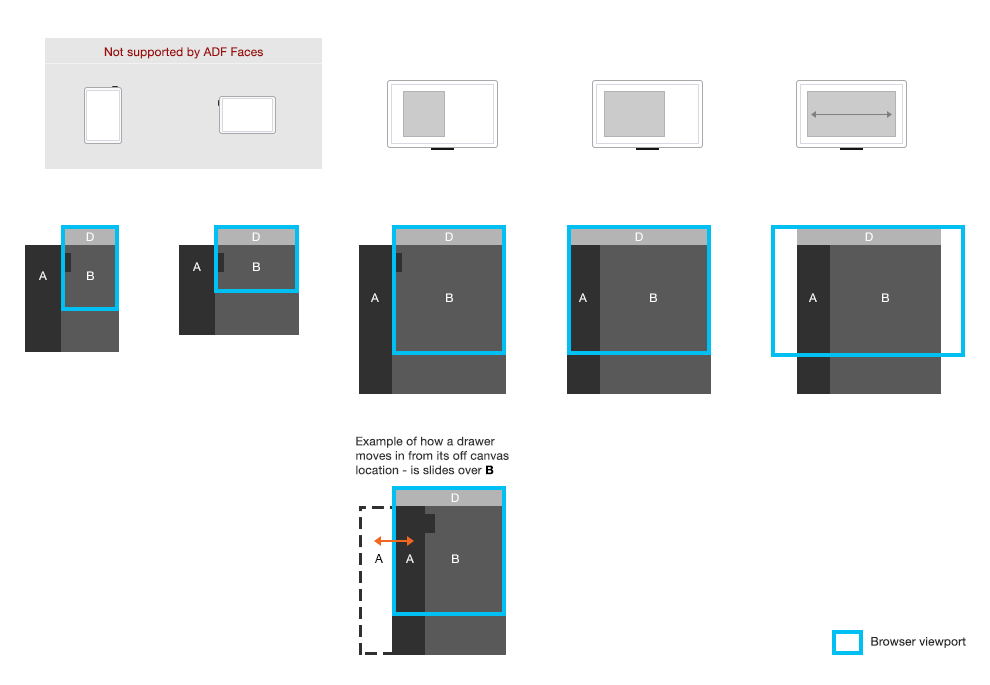
Two-Partition Patterns (Off-Canvas)
A two-partition pattern is also common, and is a derivation of the three-partition pattern. Generally, the two-partition pattern applies where there is UI chrome navigation, but no ancillary content. At the widest desktop width, the content area may also widen to accommodate responsive design block and component patterns.
The following illustration shows two page layouts for each orientation of a phone, a tablet and a desktop display, in a two-partition pattern.
Reposition Patterns
The Oracle Alta UI reposition pattern is for those use cases where it is key to for primary navigation controls to remain in view with content essential to completing the task. For example, chrome navigation controls may provide needed context or information, such as within Info Tiles.
- At all browser display widths, core content remains present and immediate to the user.
- With a change in browser display width (such as a tablet in portrait orientation), primary navigation is repositioned. Which orientation shift (for example, vertical left, horizontal top) occurs at which break points is a design decision.
- As browser display width widens, any content within the drawer is optionally repositioned onto the page.
- The goal of repositioning is to take maximum advantage of vertical page flow and to avoid horizontal page scrolling.
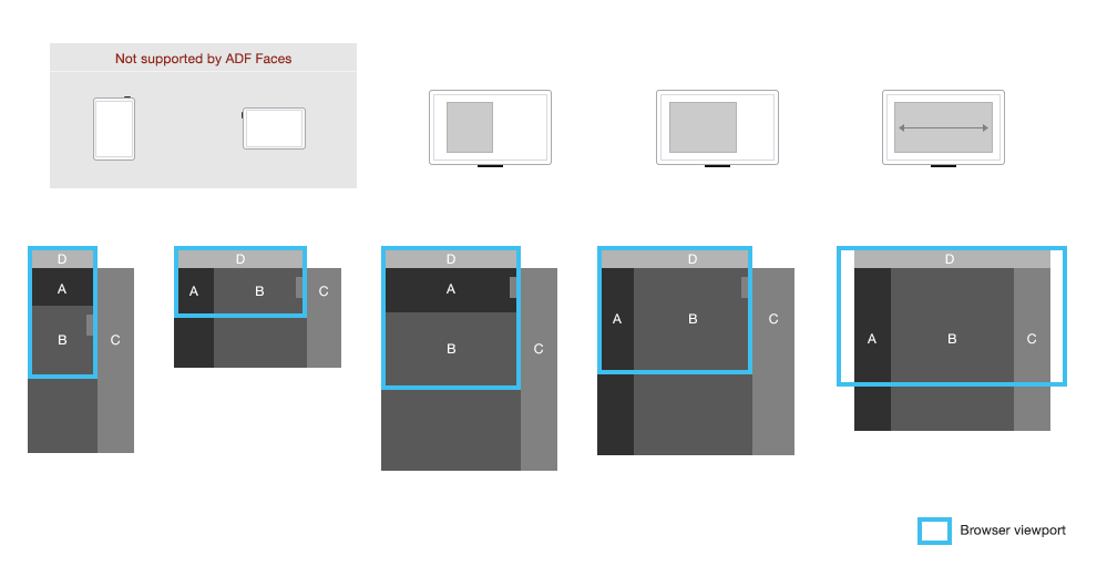
Three-Partition Pattern
In the pattern below, the page has three partitions — a typical Oracle Alta UI page layout.
- The top partition is the Branding Area.
- The center partition below it contains content essential to completing the task; and thus, has the largest proportion of the page.
- The rightmost partition contains ancillary content.
In the following illustration, the top row shows browser displays in portrait and landscape orientations, respectively. The bottom row shows the matching page layouts.
Two-Partition Pattern
An Oracle Alta UI Two-Partition Reposition pattern is a derivation of the Three-Partition pattern, but without an ancillary partition. At the page display width's widest break point, the content area may widen to accommodate responsive design block and component patterns. There are two distinct page layouts for this configuration.
As the browser display width widens beyond the maximum page display width (on a desktop, that means beyond 1440px wide), left and right margins appear.
In the following image, the top row shows browser displays in portrait and landscape orientations, respectively. The bottom row shows the matching layout.
The following is an example of a vertical-to-horizontal reposition pattern when moving from portrait orientation to landscape orientation.
Blocks
Blocks are a UI concept that refer to the general layout of content within the Content Area (content partition) of the page; thus, a block is a child of a partition. The purpose of blocks is to produce layout arrangements that avoid horizontal scrolling. A partition can have multiple blocks.
There are three block arrangements: top-down, left-right, and stacked.
Block arrangements can coincide with partition patterns. Choosing which block arrangement to use, and when one transitions to the other is a design decision. An in-context master-detail relationship and peer relationships are the most common drivers of block arrangements. The components used (such as tables, list views, and text fields) — and how they re-articulate as the browser display width changes — govern the arrangement that is used per page.
Never use a stacked block transition with auto-rotation. This creates content disparity.
Following are some heuristics that drive design decisions for the use of blocks.
| Master-Detail | Peers | |
|---|---|---|
| IN-CONTEXT | Left-Right or Top-Down | Left-Right or Top-Down |
| DRILLDOWN | Stacked | N/A |
The following image illustrates the behavior of blocks in a two-partition reposition pattern. The top row shows browser displays in portrait and landscape orientations, respectively. The bottom row shows the matching layout with a callout to the corresponding block arrangements.
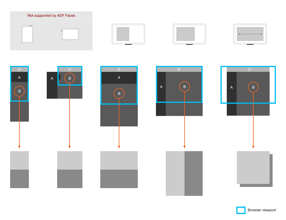
For the sake of simplicity, the label-value pairs of components within blocks may remain top-aligned rather than left-aligned with each transition, although either is permissible.
Component Re-articulations
Re-articulation is a transition technique of changing a control (such as a button bar) from one form to another. Examples are, changing from tabs to links or a button bar to a dropdown with a change in browser display width. Controls which include tables are most often re-articulated. Opting for re-articulation is a design choice.
The following UI practices are key to the effective use of the re-articulation technique:
- At all browser display widths, a re-articulated control remains present and immediate to the user.
- With re-articulation there is generally repositioning. Ensure any repositioning is not large enough to cause content disparity. This is usually guaranteed when the repositioned control remains essentially in the same spatial location.
- The apparent function of a control should not change in the mind of the user as the control re-articulates from one form to another.
Re-articulation can take place concurrently with partition and block transitions, although not necessarily. Because re-articulation can create content disparity, the following re-articulation patterns are recommended for navigation areas and data grids.
Navigation Area Re-articulation
In the typical Oracle Alta UI page layout, chrome navigation controls (for example, links, tabs, info tiles) are expected in either orientation. The reposition partition and block patterns assume this.
Pivot
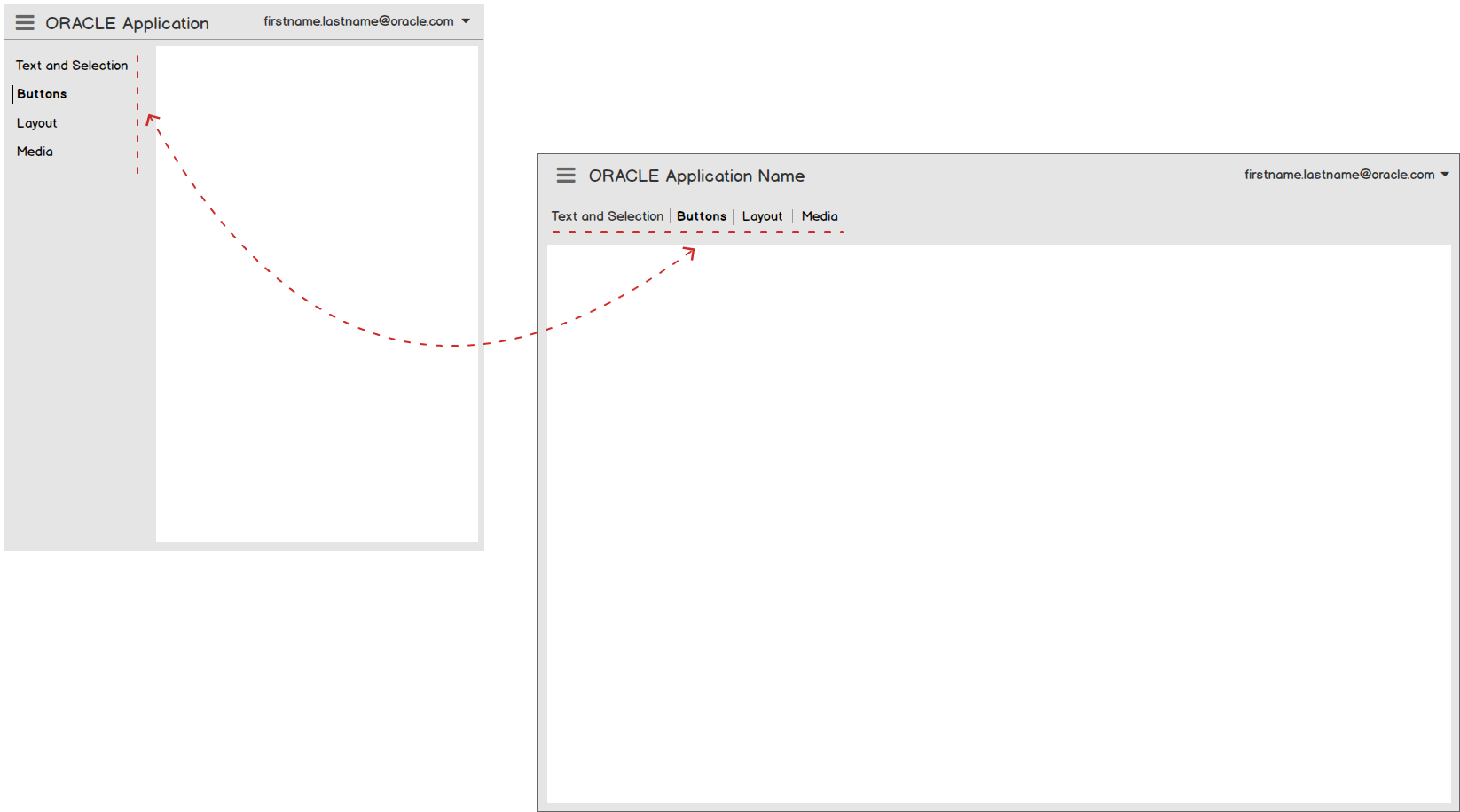
Often in a reposition pattern, navigation controls can pivot in the navigation area. Recommended pivot patterns for navigation controls are illustrated below. Note that as the navigation control pivots, it may also re-articulate. Re-articulation can work handily with recommended reposition patterns.
The following illustration shows navigation links in a portrait orientation both repositioned and re-articulated as a button bar during a pivot to a landscape orientation.
The following illustration shows finger tabs in a portrait orientation both repositioned and re-articulated as tabs during a pivot to a landscape orientation.
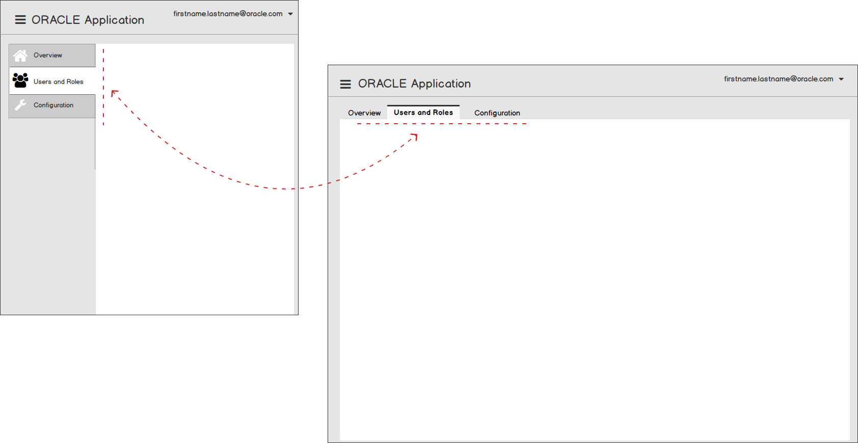
The following illustration shows a navigation list in a portrait orientation both repositioned and re-articulated as tabs during a pivot to a landscape orientation.
Data Grid Re-articulations
There are two recommended data grid re-articulations for columnated tables.
- Column Drop/Select
- Row Block
Column Drop/Select
The Column Drop/Select is a recommended component re-articulation pattern for the columnated table. As the browser display width narrows or widens, table columns are dropped or are added.
Row Block
The Row Block is a another recommended component re-articulation pattern for the columnated table. When the columnated table re-articulates to a row block, each table row effectively becomes a block of label-value pairs. The column headers are the "labels" for each row of values — laid out vertically. The Row Block can display more table attributes than the Column Drop/Select Table, given the same data and browser display width.

Example Responsive Designs in the Oracle Alta UI
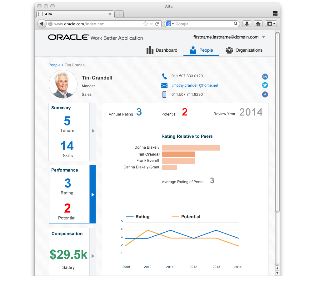
Each of the following examples incorporate the principles of Oracle Alta UI responsive design. The first is an Oracle Alta UI Page Layout in landscape orientation.
Note the left and right margins in the image above.
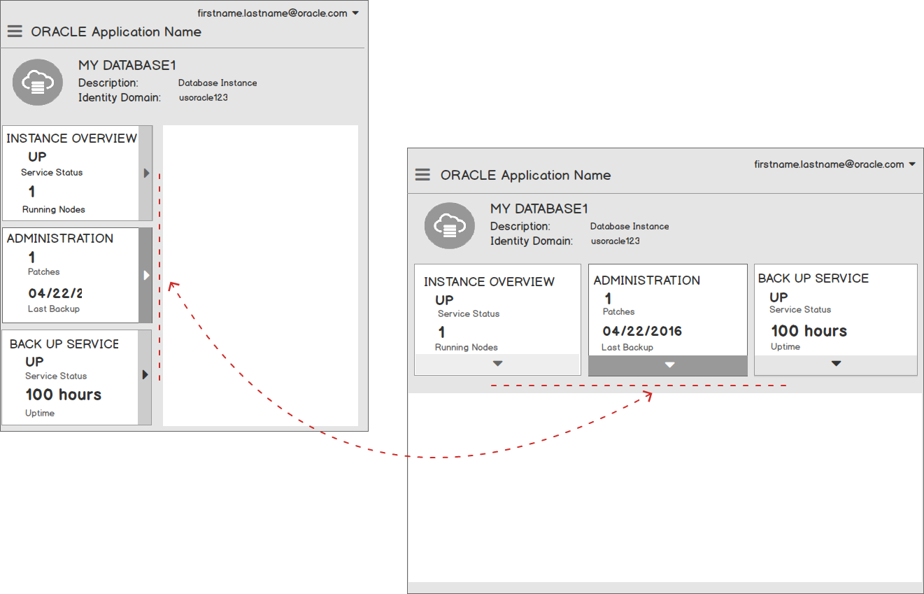
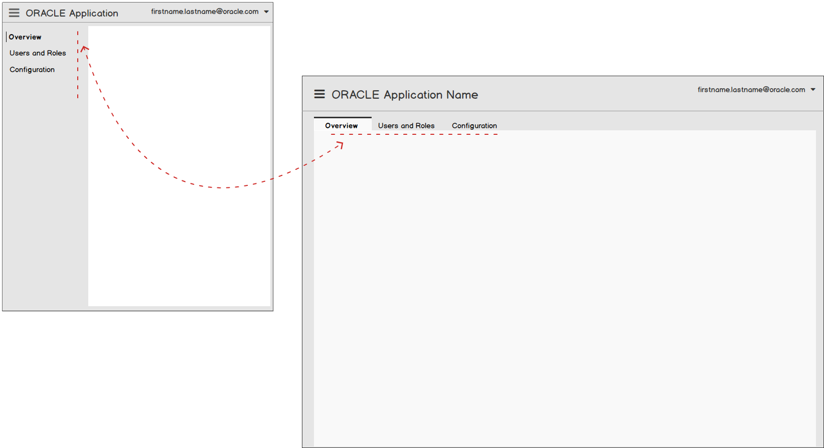
The following image is the same Oracle Alta UI page in the portrait orientation. This example illustrates repositioning the navigation partition from a horizontal to vertical orientation. Because navigation shows core content, it is not re-articulated to a drawer.
Ancillary content re-articulated or placed into a drawer is also a viable responsive design alternative for an Oracle Alta UI. In the first image the ancillary content is positioned in the Axillary Area of the page on the right.
In the second image the ancillary content is repositioned into a right side drawer as browser display width narrows.
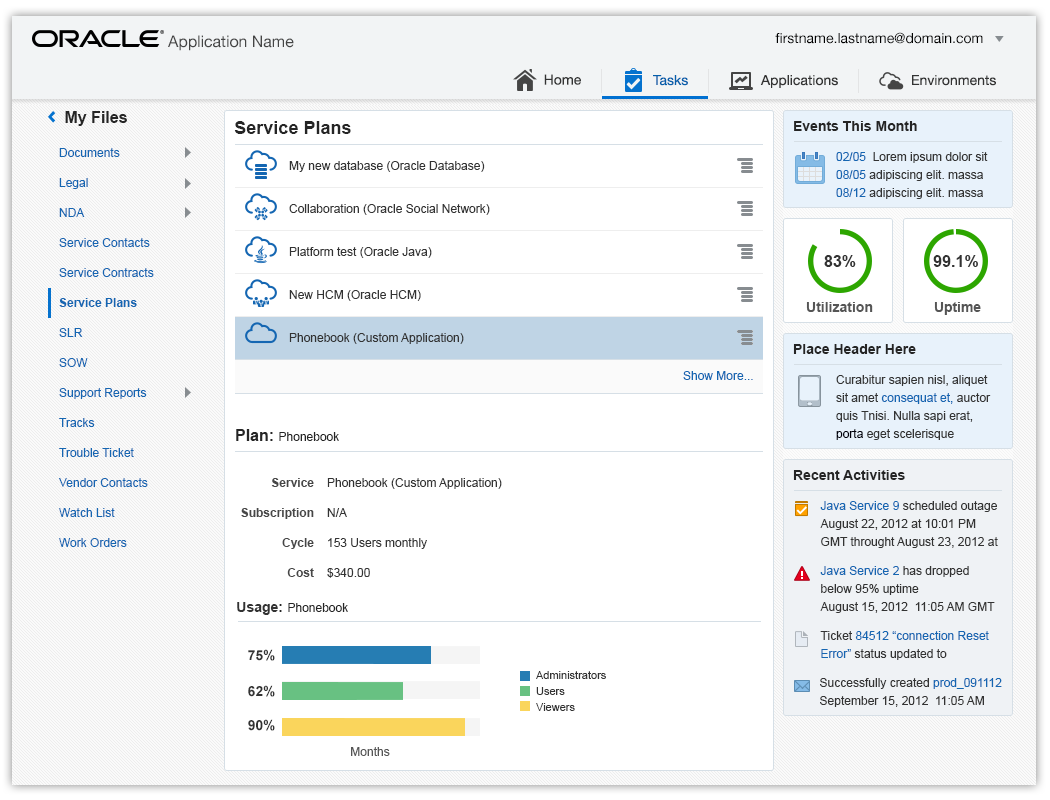
Responsively designed pages in the Oracle Alta UI have fluid layouts that easily accommodate varying browser display widths. For example, a fluid layout with table column-drop accommodates a wide browser display width, as shown below.
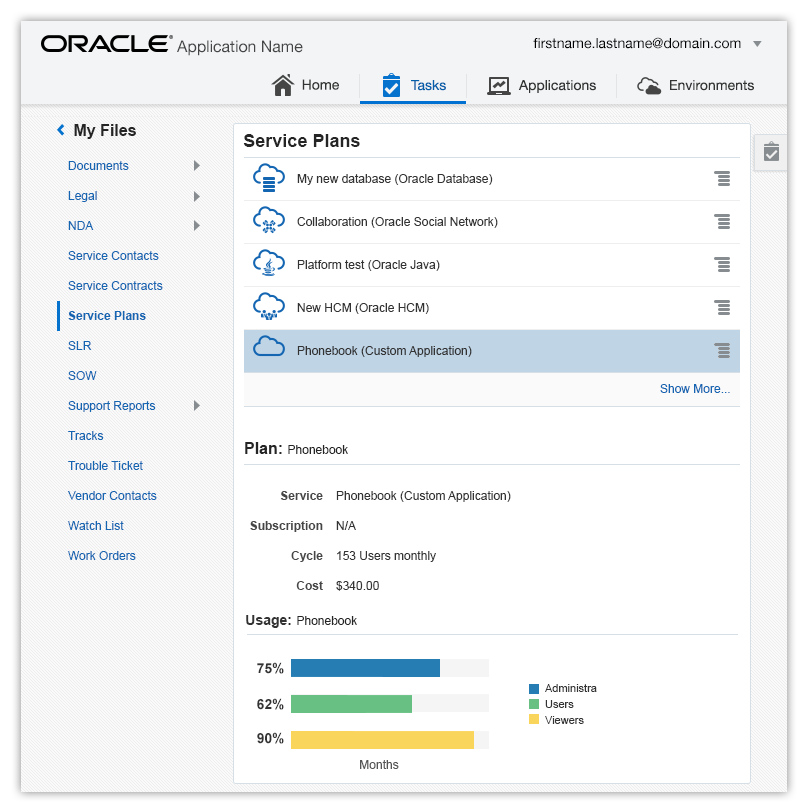
The fluid layout of the very same page and table column-drop accommodates a narrower browser display width, as illustrated below.
Additional Resources
Demos: