Contents
- Overview
- Use Cases for Colored Regions
- Designing for Colored Regions on the Page
- Color Palettes for Various Font Colors and Sizes
Overview
The Page Layout pattern identifies areas of the page that appear frequently within an Oracle Alta UI. Color can be used to distinguish content in different areas of the page, helping users complete tasks more easily.
Colored regions must not be used in a way that will compete with colorful visual content and distract users or obfuscate information a user needs to see. Instead, use color in a manner complementary to other UI elements on the page. Strike a balance between the content the user needs to see and color that is pleasing to the eye.
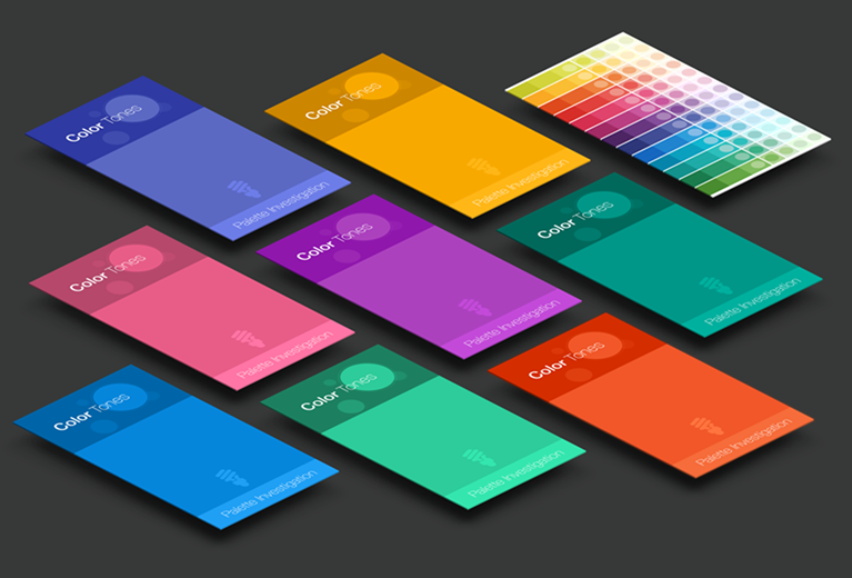
Use Cases for Colored Regions
The following are the principal purposes for designing color into regions of a page:
- Highlighting: Use a single colored region on an important part of a page to call the user's attention to it. The blue box in the Ancillary Area colored regions image below is an example.
- De-emphasis: Light gray regions communicate that they are secondary or supplemental to other content on the page. The gray box in the Ancillary Area image is an example.
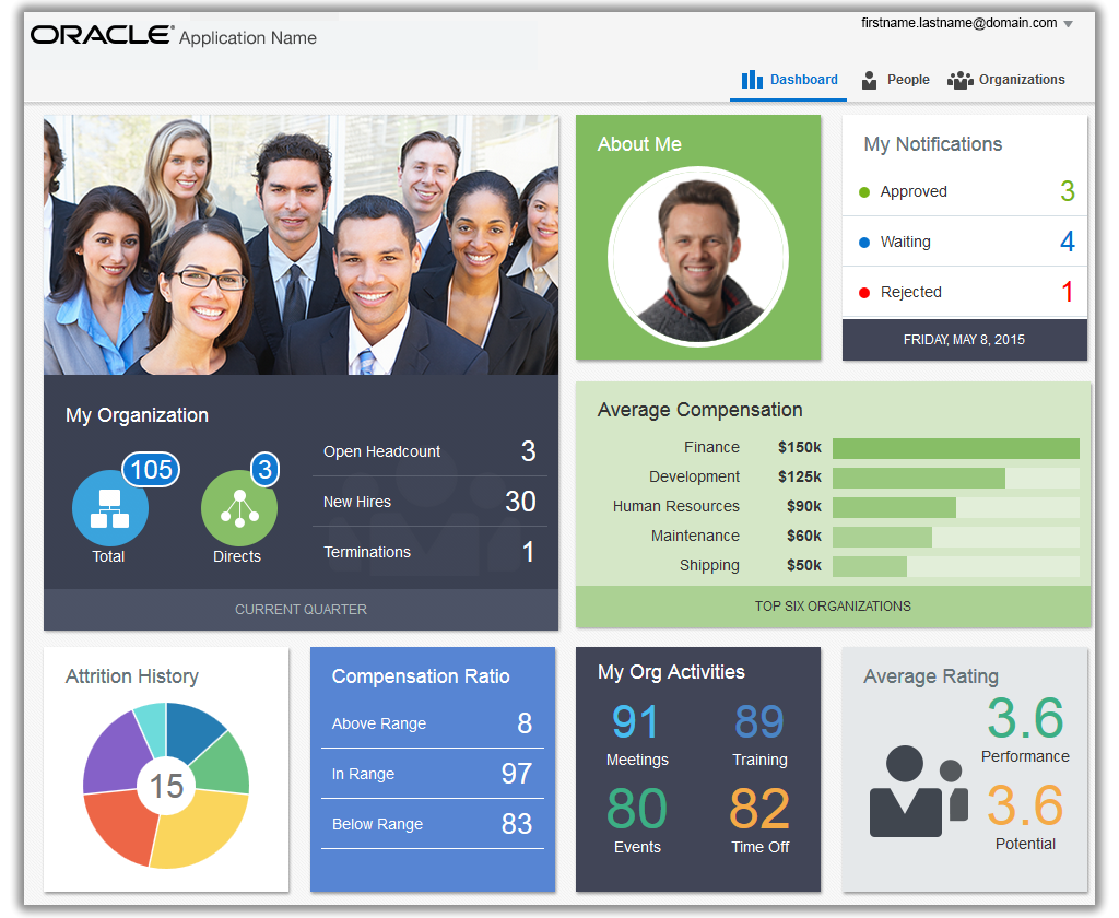
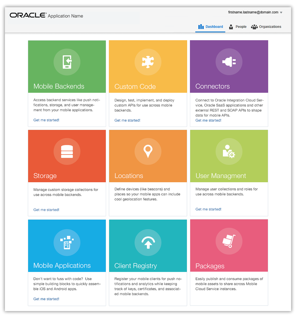
- Differentiation: Apply multiple colors to page elements to help the user see items as distinct, whether the items are heterogeneous or homogeneous. See the first and second Dashboards examples below, respectively.
- Decoration: In this case, color is an element whose purpose is largely decorative on the page, although it may feature content and play a role in emphasizing an area, due to its size. The Hero Banner is an example of this. Teams should exercise caution in choosing to create colored regions for decorative purposes, as it could lead the user to expect that the colored region has a specific meaning.
Designing for Colored Regions on the Page
The following are a few principal patterns to follow when designing colored areas on a page. These help avoid confusion that could be created by competing colored content and colored regions.
The font size and color of text, and the background color of a content container should meet accessibility color contrast criteria.
Hero Banner
A Hero banner is a large colored banner prominently placed top and center on a web page. The Hero banner is most often found on the Home page of a cloud service. Its purpose is to grab the user's attention and present an overview of the service's purpose. It often consists of an image, text, or both. Each of these is either static or dynamic. A dynamic Hero banner may also display a repeating cycle of images and topics.
Every element of a Hero banner is designed and tested to work well together, for example, in terms of color contrasts and composition. The banner itself is designed to display independently of the balance of the page, so that neither its content nor its behavior affects or is affected by user data at runtime.
The Hero banner may contain controls such as a Get Started button and video play button as shown in the example image below.
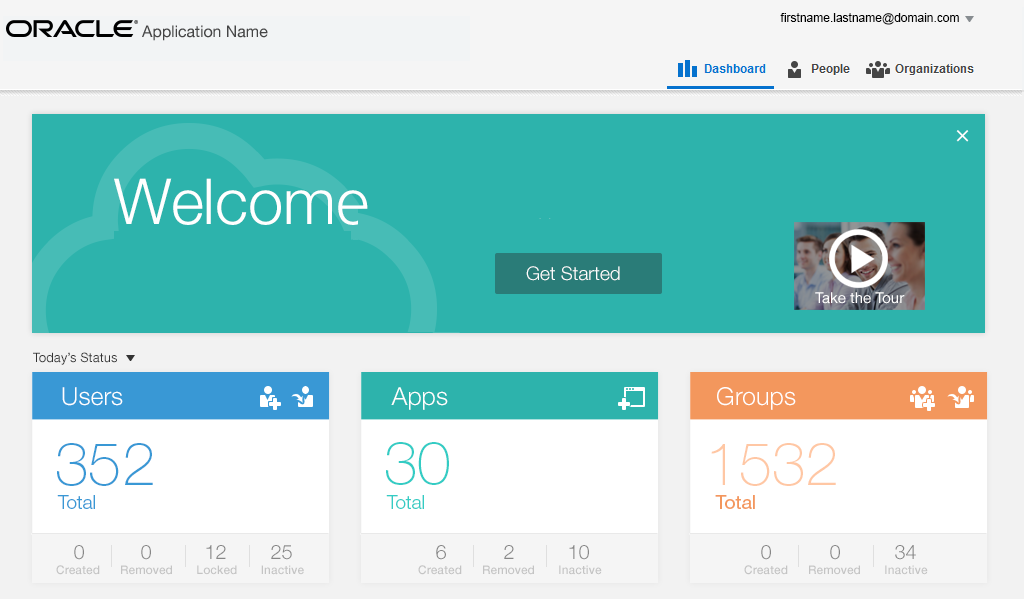
The Hero image may contain a looping animation, as well as controls to pause the animation. There may also be a control to dismiss the Hero banner, particularly if the banner is also used to access First-Time user assistance, such as Get Started. The color for any content or control, as well as the absence or presence of a Hero banner itself on the page, should be designed to all work together, to meet both accessibility and usability requirements.


Ancillary Area
The optional Ancillary Area of a page affords an opportunity to present either a colored region or colored content containers partitioned within the Ancillary Area.
The following is an example of an Ancillary Area of a page that employs colored containers to communicate important information (blue container) and less important information (gray container) on the page. It uses the default Oracle Alta UI font size and color.
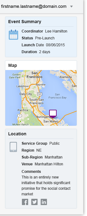
There are custom font colors for typical body font sizes that meet accessibility criteria for white and light gray colored regions. In general, the larger the font size, the easier it is to meet accessibility criteria within a colored region using a white font color.
The choice of using either default colors or custom colors is use case-driven.
Content Area Containers
Colored regions are not limited to the Ancillary Area. A Content Area composed of content containers can also utilize color, following the same parameters as the Ancillary Area, as in the following image.
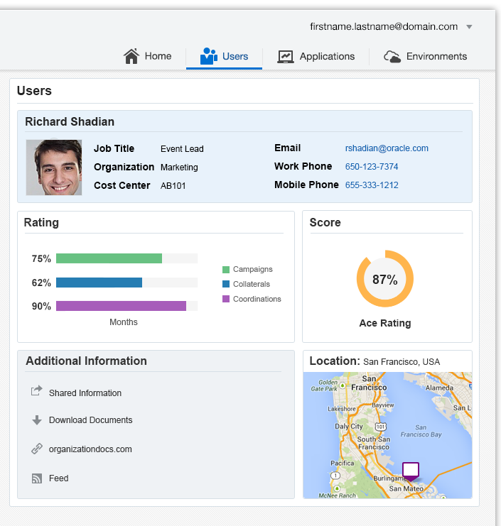
Consider using a Hero banner across the Content Area as a decorative accent when the page content area does not feature colored regions, or when it will not work well to use multiple colored regions within the Content Area.
Dashboards
Dashboards are composed of regions or content tiles. These provide ample opportunity to utilize both color and photography. Each content tile within the dashboard is specifically designed to handle any runtime user data updates that would often occur within any dashboard content tile.
The content within dashboard tiles is often dynamic, but static content may appear within dashboard tile as well. For example, each tile within a static dashboard may present a different navigational choice, as shown in the image below. A static dashboard may provide the broadest and least challenging opportunity to create colored regions. Each tile is carefully designed for optimal content legibility.
Color Palettes for Various Font Colors and Sizes
Choosing which colors to use can be a challenge. The Oracle Alta Typography pattern presents a set of color choices to assist in the decision.