Contents
- Overview
- Page Signage Options
- Sign In Area Attributes
- Exception Handling
- Sign Out
- Accessibility Mode Preference
- Using Previous Release Visual Designs
Overview
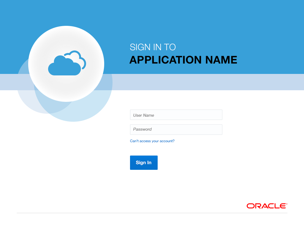
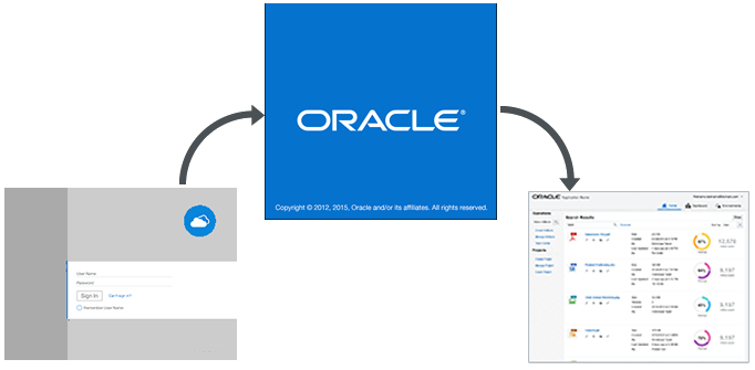
The Sign In page authenticates a user. Once valid credentials are provided for an Oracle Alta UI application, the user lands either on the default page, such as a Home page, or on any other page for which the cloud service allows deep linking. Depending on the page, initial display may occur less than instantaneously. If a wait indicator is necessary prior to the load of the initial page, then the Oracle Alta UI splash page should appear, as illustrated below.
Page Signage Options
Users arrive at a sign in page from a number of locations, for example, from an email invitation, website, or chat message. They expect clear confirmation from the Sign In page that it represents their intended destination, so it is important that the signage on this page clearly communicates that.
The Oracle Alta Sign In page has two variants: cloud and on-premise. Signage options and and page background choices are governed by how the application is deployed (for example, sole or shared cloud identity domain).
By default, the two variants are distinguished by logo and the presence or absence of co-branding on the page. The default logos which distinguish cloud and on-premise services are shown below.
| Cloud Logo | On-Premise Logo |
 |
 |
Any cloud service with its own identity domain or on-premise product has an option to replace the default logo with an Oracle-approved logo.
- The product name of each service deployed to the cloud is co-branded with the term "Cloud." Cloud services that share the same identity domain, for example, "corp," display the same product name on the sign in page.
- Applications deployed on-premise have no co-branding, and potentially have more specific product names.
| Cloud Product Signage | On-Premise Product Signage |
 |
 |
Sign In Page Photo and Color background Options
For both cloud and on-premise products that are displayed on the desktop in the Oracle Alta UI, a contemporary, full photographic background design option is preferred.
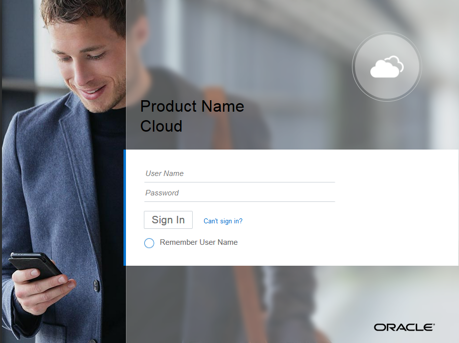
Although the photographic images for the Oracle Alta Sign In page were optimized for file size, the mobile context may present a challenge in cases of limited bandwidth or other release criteria. To address that, two options other than the full photo design are available: partial photo and colored versions.
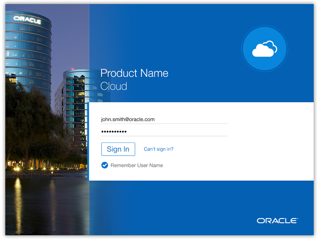

The choice of full photo, partial photo, or colored background is summarized below.
| Desktop | Tablet | Phone | |
| Full Photo | Yes | Yes | Yes |
| partial Photo | Yes | Yes | Yes |
| Color | No | Yes | Yes |
In cases where the default photograph is not desired, a library of alternative photo choices is available in the Oracle Alta Cloud Sign In Page Gallery.
Sign In Area Attributes
The Sign In Area is that portion of the page where UI controls and fields appear which are directly or indirectly applicable to authentication. The options here are not tied to where or how the application is deployed, but to various use cases. The following attributes can appear in the Sign In Area:
- UI Controls
- Input fields
- Can't Sign In? link (public-facing only)
- User Name registration link (mandatory for public-facing pages)
- Remember User Name, Keep Me Signed In links(optional)
- Sign In with link (optional)
- Language selection control (optional)
- Copyright and Trademark text or links
At least three UI controls must appear in the Sign In Area: User Name, Password fields, and the Sign In button. The prompts for User Name and Password appear as placeholder text. Although placeholder text as a prompt is generally not recommended (due to certain accessibility issues), the sign in page is an exception. The twin input text fields with the Sign In button are a de facto industry standard, well recognized by users.
- User Name and Password are the minimally required input fields. Set sufficient width in the field to allow the user to see the entire user name and hidden password glyphs. This helps reduce problems caused by typos that might otherwise lie out of view.
- The User Name field should receive initial input focus.
- The sign in page templates offered in the Oracle Alta Cloud Sign In Page Gallery meet these criteria.
The "Can't sign In?"link is present for public-facing scenarios. It is optional for private-facing scenarios.
User Name registration is specific to public-facing use cases, where a new customer, client, or partner, for example, can request an account to utilize the services and applications provided. Because the Oracle Alta UI offers flexible methods of user registration, user name registration is not part of the default layout of the Sign In page.
- If necessary and desired on the Sign In page, user name registration would follow the Cannot access your account? link. This self-service feature is not typically used with private-facing sign in pages, because appropriate access privileges are usually granted as a function of becoming an employee or contractor in the privately protected application use case.
The optional "Remember Me" check box is a common control that allows for the capture of a provided user name credential for subsequent authentication. The user sets the check box to store the currently provided credential . On subsequent visits to the Sign In page, the provided user name is piped to the input fields (usually from a cookie).
Although rarely seen with transactional applications, a "Keep me signed in" option may appear, as fits with the application's security policy. When enabled, the user does not see a sign-in challenge on subsequent visits unless he or she had signed out manually before. Once the user signs out, it is good practice for the application to destroy the cookie for the user.
The Sign In with prompt precedes one or more icon buttons signifying partner authentication schemes. These typically appear with a public-facing sign in page. Essentially, this allows the user to authenticate to the current service using the credentials of a third-party identity store.
- The Sign In with prompt and subsequent icons appear in what is called the "drawer." This is essentially an optional banded area, where this and other options can appear.
- This type of prompt is offered as an optional feature of the Sign In page templates available in the Oracle Alta Cloud Sign In Page Gallery.
A language selection control feature is highly desirable in certain use cases. It features a dropdown menu listing the names of languages in their native characters. Consider this option when the user of the local client is not assumed to be the sole user of the machine — such as on public machines, loaners, or shared employee systems. In that case, the language of the machine and browser is not likely set to the current user's preference.
- The user's selection of a language refreshes the default page to the selected translation. All subsequent pages, such as password recovery pages, also display in the selected language. Care is required to ensure that the languages listed in the dropdown are matched by the equivalent translated pages.
- Ideally, a universally recognized icon, such as a flat world map icon, is displayed to help the user identify the UI control.
- The language selection control icon is the one exception where an icon is used as a UI prompt. It also appears in the optional drawer location.
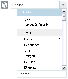
A required copyright is the last item to appear in the "drawer" for desktop clients. Once mobile users have performed first-time authentication, then the copyright subsequently appears in the splash page that precedes the display of the Sign In page.
- Other notices, such as a trademark notice, may also appear in the splash page for mobile clients.
- For desktop clients, a link to an About Page follows the copyright in the drawer location.
Exception Handling
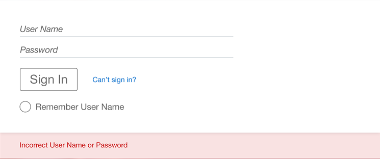
Exception handling is required for instances of unsuccessful authentication attempts. Feedback to the user is returned inline, and the exception message must not indicate which aspect of the authentication failed (such as either user name or password). Instead, the message should use general terms to indicate that the authentication sequence failed, as shown in the following image.
Sign Out
When the user signs out of an application, the result should return to the corresponding sign in page for the application. In some cases, it is desirable to have an intervening page confirming that the user has signed out.
- Neither the user nor any other user may visit secured pages after a sign out without authenticating (for example, by attempting to use the browser Back button).
Another sign out scenario is a session or security time out. When this occurs, the user is directed out to the Sign In page. It may be desirable to include an intervening page to notify the user that a sign out has occurred for security purposes or for an expiry due to an idle session (a session time out).
- It is good etiquette to notify users of a pending sign out action before it occurs, to allow them to either avoid it or allow it.
Accessibility Mode Preference
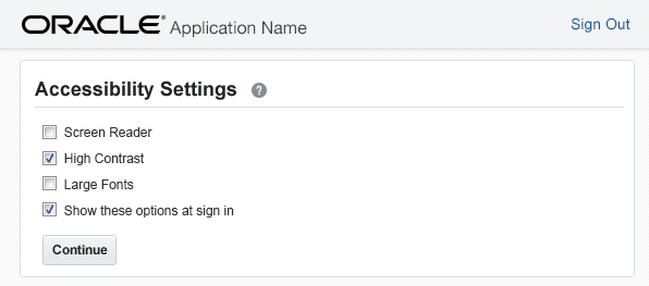
Accessibility selection is triggered by the Sign In button. It is required by ADF Faces implementations where the accessibility preference of the user was not captured earlier as a function of account creation (usually as part of self-service registration or employee on-boarding process). It appears for first-time users, and for any user who opts to not circumvent it on subsequent authentication. Accessibility selection contains the following UI components.
- Heading
- Help icon
- Note that any subsequent settings changes made after sign in are made from the Settings menu.
- Check boxes listing the following options:
- Screen reader
- High contrast
- Large fonts
- Show these options at sign-in
- A Continue button
These options should also present themselves to users in the Settings UI.
The Oracle ADF Faces Sign In accessibility flow consists of three pages for first-time users, and two pages for subsequent users.
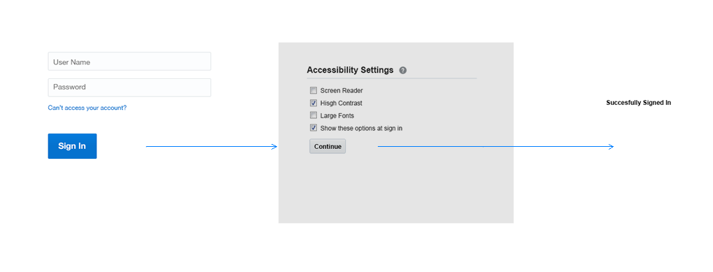
First-time users should experience the following:
- Sign In Page
- Accessibility Mode Selection Page
- Product-specific Home Page.
Between the Accessibility Mode Selection Page and the product-specific Home Page, a product may elect to augment the flow with additional authentication security features (for example, challenge questions for user name, password, identity domain recovery, or present terms of use).
The Accessibility Mode Selection Page should follow the Page Layout pattern to provide sufficient context and visual consistency to assure the user that the UI is still part of the application. However, the Accessibility Mode Selection Page, like the Settings pattern, is a modal page that presents no controls that could navigate the user away from this page (other than the Sign Out link). The Branding Area is devoid of any navigation controls, such as search, Application Navigation, or the User Menu. A footer, if present, is also devoid of any navigation links.
With this presentation, there is no question as to user intent, because there are only two methods for navigating away from the Accessibility Mode Selection page: the Continue button or the Sign Out link. The Continue button should map to the <Enter> key.
Previous Sign In Page Visual Designs
The current Oracle Alta UI Sign In design represents the latest. However, an earlier version of the page design remains an option for those products currently using the release for which this was offered.
