Revamped home energy report shows what really motivates us to cut energy use
Oracle Utilities Opower makes it easier for utility customers to take action.
By Margaret Lindquist | August 2020

In March, in response to the global pandemic, many utility companies shut down any customer communications that weren’t directly related to immediate needs—such as reassuring people that their power and water would stay on, or helping people struggling to pay their bills. An oft-cited statistic in the utility industry says that the average utility customer spends 10 minutes a year thinking about their utility, so utilities wanted to make sure that customers who were worried—or facing economic stress—weren’t seeing irrelevant content.
What happened, though, surprised utilities: People wanted more content than ever.
Customers were more likely to open their emails and visit utility web sites. They were looking for money-saving tips and easy ways to consume less energy, since many people were home more than usual and therefore using more energy. “There was certainly a brief period when people thought utilities should communicate less, followed by a period where they were saying, ‘Hey, we should actually communicate more,’” says Julia Lundin, senior director of Oracle Utilities Opower’s commercial strategy. “We've seen increased rates of engagement, in particular on home energy audits. We see that people wanted a kind of diagnosis about what is driving the bill in their home.”
In the midst of this unprecedented time for utilities, Oracle Utilities Opower leaders rolled out the most ambitious redesign of their flagship home energy reports (HER) since they pioneered such reports, more than a decade ago. In the past, the HER looked the same for every utility customer. “That breadth helps us deliver to millions of customers, but what if we were able to move from one-size-fits-all and make it even more clear that the content was actually personalized for you?” says ML Haynes, director of design and content for Oracle Utilities. With new interactive features, colors, and a more dynamic, streamlined design, the new Opower HER allowed for more of that personalization.
Utilities haven’t seen their metrics for customer engagement and action decrease, but Opower saw an opportunity to do more. “The concern was that HERs were starting to get old,” Haynes says. “We were still able to capture the energy efficiency that we were looking for, but the levels of customer satisfaction weren’t where we wanted them to be.”
The Opower team decided to blow up the reports, relying on research to know what people want. They learned, for example, that people aren’t motivated by energy savings of less than $5 to $10 a month. And that they feel that there are far fewer opportunities to reduce energy consumption while still being comfortable in the summer than in the winter.
“What if we were able to move from one-size-fits-all and make it even more clear that the content was actually personalized for you?”
That research led to three goals for the new HER: keep the focus on energy savings, increase customer satisfaction, and increase engagement on digital channels, such as web and mobile. Opower has sent out nearly a billion HERs since its founding, resulting in 25 terawatt-hours of energy savings. To put that in context, that’s enough to power to toast 5,700 billion slices of bread. This allows consumers to save money and reduce their carbon footprint.
“With the new HERs, clients can do two things at once—one, capture more lifetime value from each customer relationship, and two, accelerate adoption of all the things we need in order to build a clean energy future,” says Paul McDonald, senior director of industry strategy at Oracle Utilities.
Here are three of the biggest changes people are seeing now:
Efficiency zones
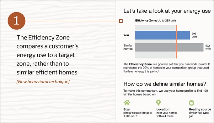
Existing HERs offered a ‘neighbor comparison,’ but some people found the comparison embarrassing or offensive, so the team looked for a replacement. “A big cornerstone of the new report is the efficiency zone, which takes away that comparison to the most efficient neighbors and focuses the customer on an efficiency zone that they can reach,” says Jessica Bloom, Oracle Utilities group product manager. A customer’s energy use is compared to a target zone, rather than to the most efficient homes in their neighborhood.

Energy use benchmarks
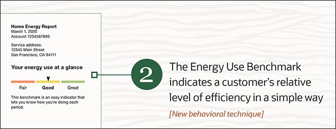
One of the first things a customer will see at the top of their report is the energy use benchmark, which indicates a customer's relative level of efficiency on a scale of fair to great. “We found that users trust the benchmark as a reliable marker of how efficient they are, so the gauge became an anchor point in the report,” Bloom says. “It helps customers understand that the benchmark is a summary of the energy insights in report.”

‘Moments of pride’
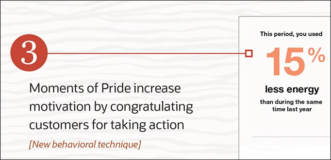
Research showed that customers want to be congratulated for taking an action, and that can motivate those customers to become even more energy efficient. “We're using the principle of ‘moments of pride’ to celebrate the small wins of using less energy year over year,” McDonald says.

Learn more
Illustrations: Oracle
