Laying Out a User Interface with JavaFX 2.0
By James L. Weaver
Published March 2012
Learn to use the layout capabilities of JavaFX 2.0 to make nodes in the scene graph appear where you want them to be and more.
Downloads:
- Java FX
- NetBeans IDE
- Sample Code (Zip)
Introduction
JavaFX 2.0 is an API and runtime for creating Rich Internet Applications (RIAs). JavaFX was introduced in 2007, and version 2.0 was released in October 2011. One of the advantages of JavaFX 2.0 is that the code can be written in the Java language using mature and familiar tools. This article focuses on using the layout capabilities of JavaFX 2.0 to make nodes in the scene graph appear where you want them to be and be the appropriate size as the window is resized.
JavaFX comes with its own layout classes, shown in Figure 1 (from Amy Fowler’s JavaOne 2011 presentation), whose purpose is to provide convenient ways to lay out the user interface regardless of the size of the scene or type of platform. These classes are located in the javafx.scene.layout package. This article contains an example of using the BorderPane and HBox classes, and other layout-related JavaFX classes, to create a commonly used UI layout format.
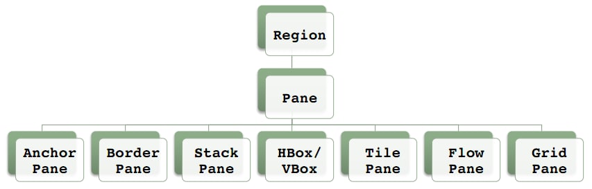
Figure 1: JavaFX Layout Classes
All layout classes are responsible for controlling the location of their managed child nodes (a node can optionally be set as not managed). In addition, most layout classes under certain circumstances also resize their resizable child nodes. In Step 1, we’ll discuss the behavior of resizable nodes further.
Going from left to right on the bottom of Figure 1, Table 1 contains a brief description of each layout class and its behavior pertaining to resizing its children.
Table 1: Layout Classes and Their Children-Resizing Behavior
Layout Class |
Description and Children-Resizing Behavior |
|---|---|
AnchorPane |
Allows child node edges to be anchored to the parent’s edges. Children are not resized. |
BorderPane |
Provides classic top, left, right, bottom, center child placement. Horizontally resizes child nodes placed in the top and bottom, vertically resizes child nodes placed in the left and right, and resizes nodes placed in the center both horizontally and vertically. All resizing is up to the node’s maximum size in the relevant directions. |
StackPane |
Layers children back to front. Resizes child nodes to fill the size of the parent (up to each node’s maximum width and height). |
HBox |
Contains a single row of nodes. Child nodes are resized horizontally to their preferred widths, but individual child nodes can be explicitly set to grow horizontally to their maximum widths. By default, child nodes are resized vertically to their maximum heights. |
VBox |
Contains a single column of nodes. Child nodes are resized vertically to their preferred heights, but individual child nodes can be explicitly set to grow vertically to their maximum heights. By default, child nodes are resized horizontally to their maximum widths. |
TilePane |
Provides a horizontal or vertical flow of uniform “tiles” that wrap. Resizes child nodes to fill the size of the tile (up to the node’s maximum width and height). |
FlowPane |
Provides horizontal or vertical flow of children that wrap. Children are not resized. |
GridPane |
Places children in a flexible grid, which is great for complex layout. Resizing is based upon constraints explicitly set on a given row or column. |
We’ll discuss the behavior of resizable nodes a bit later in Step 1.
Overview of the LayoutSansTearsSolution Application
To help you learn how to lay out the UI in JavaFX, an example application named LayoutSansTearsSolution will be employed. As shown in Figure 2, the UI for this application contains a header area, a tabbed pane area, and a footer area, and its appearance is adjusted, as the user would expect, when the window is resized.
The LayoutSansTearsExercise project that you'll download in the next section contains starter code for this example application. In its current form, the application’s runtime appearance looks like Figure 6. During the course of this article, you'll modify the code to implement the layout appearance of the LayoutSansTearsSolution application shown in Figure 2.
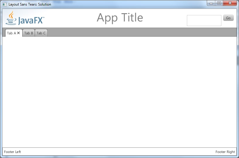
Figure 2: Screen Capture of the
LayoutSansTearsSolution Application
When you resize the window of the LayoutSansTearsSolution application, as shown in Figure 3, the relative positions of the nodes are adjusted accordingly. For example, the Footer Left and Footer Right labels move closer to each other, and the App Title header text stays horizontally centered.
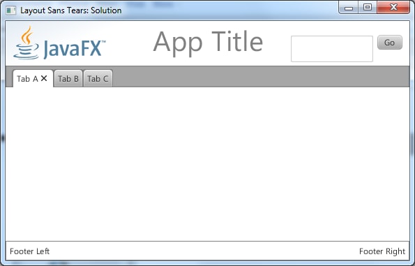
Figure 3: Screen Capture of
LayoutSansTearsSolution after Resizing the Window
In addition, the tab pane in the center of the window resizes to take all available horizontal space, as well as any space not used by the header and footer.
Obtaining and Running the LayoutSansTearsExercise Project
- Download the NetBeans project file (Zip), which includes the
LayoutSansTearsExerciseproject and theLayoutSansTearsSolutionproject. - Expand the
LayoutSansTearsExerciseproject into a directory of your choice. - Start NetBeans, and select File -> Open Project.
- From the Open Project dialog box, navigate to your chosen directory and open the
LayoutSansTearsExerciseproject, as shown in Figure 4. If you receive a message stating that thejfxrt.jarfile can't be found, click the Resolve button and navigate to thert/libfolder subordinate to where you installed the JavaFX 2.0 SDK.
Note: You can obtain the NetBeans IDE from the NetBeans Website.
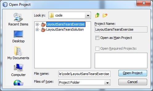
Figure 4: Opening the
LayoutSansTearsExercise Project in NetBeans
- To run the application, click the Run Project icon on the toolbar or press the F6 key. The Run Project icon looks like a Play button on a media (for example, DVD) player, as shown in Figure 5.

Figure 5: Running the Application in NetBeans
The LayoutSansTearsExercise application should appear in a window, as shown in Figure 6.
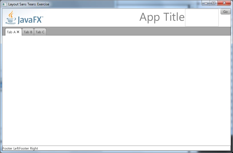
Figure 6: Screen Capture of the
LayoutSansTearsExercise Application
Notice that the App Title text, search text area, and Go button are bunched together on the right side of the header. Also, the search text area appears stretched vertically but our desired height is just tall enough to allow a couple of lines of text entry. In addition, the Footer Left and Footer Right labels are bunched together on the left side of the footer.
Your mission will be to add code that implements the layout appearance and behavior described previously and shown in Figures 2 and 3. Next, we’ll discuss the steps you can follow to implement this appearance and behavior.
Step 1: Reviewing the Layout Strategy Used in the LayoutSansTearsExercise Application
The top-level layout strategy used in the LayoutSansTearsExercise application is to place a BorderPane in the root of the scene. When a layout class, or any other resizable class, is used as the root node of the scene, that node is automatically resized as the scene is resized. Consequently, as the user resizes the application window (the JavaFX stage), the BorderPane is resized to fill all the space inside the window.
In addition to creating a BorderPane, an HBox is created to hold the nodes in the header, and it is placed in the top of the BorderPane. A TabPane is then created and placed in the center of the BorderPane. Another HBox is then created to hold the nodes in the footer, and it is placed in the bottom of the BorderPane.
Take a look at the code in Listing 1, which shows the starter code for the example application and is located in the LayoutSansTears.java file.
package javafxpert.layoutsanstears.ui;

import javafx.application.Application;
import javafx.scene.Scene;
import javafx.scene.SceneBuilder;
import javafx.scene.control.*;
import javafx.scene.image.Image;
import javafx.scene.image.ImageView;
import javafx.scene.layout.*;
import javafx.stage.Stage;

public class LayoutSansTears extends Application {

  public static void main(String[] args) {
    Application.launch(args);
  }

  @Override
  public void start(Stage primaryStage) {
    Region headerLeftSpring = new Region();

    // TO DO: Declare a variable of type Region, assigning a
    // new Region object to it for use as a "spring" in the
    // header between the title of the app and the search box

    // TO DO: Declare a variable of type Region, assigning a
    // new Region object to it for use as a "spring" in the
    // footer between the left and right labels

    ImageView logo = new ImageView(
      new Image(getClass().getResourceAsStream("images/javafx-logo.png"))
    );

    HBox searchBox = HBoxBuilder.create()
      .spacing(5)
      .children(
        TextAreaBuilder.create()
          .prefWidth(120)
          .prefHeight(40)

          // TO DO: Use a method of the TextAreaBuilder to set the maximum
          // height of the TextArea to its preferred size

          .build(),
        ButtonBuilder.create()
          .text("Go")
          .build()
      )
      .build();

    Scene scene = SceneBuilder.create()
      .stylesheets("javafxpert/layoutsanstears/ui/myStyles.css")
      .width(800)
      .height(500)
      .root(
        BorderPaneBuilder.create()
          .top(
            HBoxBuilder.create()
              .children(
                logo,
                headerLeftSpring,
                LabelBuilder.create()
                  .id("app-title")
                  .text("App Title")
                  .build(),

                // TO DO: Insert the Region object created to act as a "spring"

                searchBox
              )
              .build()
          )
          .center(
            TabPaneBuilder.create()
              .tabs(
                TabBuilder.create()
                  .text("Tab A")
                  .build(),
                TabBuilder.create()
                  .text("Tab B")
                  .build(),
                TabBuilder.create()
                  .text("Tab C")
                  .build()
              )
              .build()
          )
          .bottom(
            HBoxBuilder.create()
              .id("footer")
              .children(
                new Label("Footer Left"),

                // TO DO: Insert the Region object created to act as a "spring"

                new Label("Footer Right")
              )
              .build()
          )
          .build()
      )
      .build();

    HBox.setHgrow(headerLeftSpring, Priority.ALWAYS);

    // TO DO: Use a static method of HBox to allow the headerRightSpring
    // to compete for any extra horizontal space

    // TO DO: Use a static method of HBox to allow the footerCenterSpring
    // to compete for any extra horizontal space

    // TO DO: Use a static method of HBox to give the searchBox
    // a margin of 20 pixels on the top and 10 pixels on the right

    primaryStage.setTitle("Layout Sans Tears: Exercise");
    primaryStage.setScene(scene);
    primaryStage.show();
  }
}
Listing 1: LayoutSansTears.java
Using the SceneBuilder and BorderPaneBuilder Classes
The starter code in LayoutSansTears.java makes use of builder classes in the JavaFX 2.0 API, including the SceneBuilder and BorderPaneBuilder classes shown in Listing 2. These classes create instances of Scene and BorderPane, respectively.
Note: There are some “TO DO” comments in the code (for you to fill in later during Step 2) that have been omitted from Listing 2.
    Scene scene = SceneBuilder.create()
      .stylesheets("javafxpert/layoutsanstears/ui/myStyles.css")
      .width(800)
      .height(500)
      .root(
        BorderPaneBuilder.create()
          .top(
            HBoxBuilder.create()
              .children(
                logo,
                headerLeftSpring,
                LabelBuilder.create()
                  .id("app-title")
                  .text("App Title")
                  .build(),
                searchBox
              )
              .build()
          )
          .center(
            TabPaneBuilder.create()
              .tabs(
                TabBuilder.create()
                  .text("Tab A")
                  .build(),
                TabBuilder.create()
                  .text("Tab B")
                  .build(),
                TabBuilder.create()
                  .text("Tab C")
                  .build()
              )
              .build()
          )
          .bottom(
            HBoxBuilder.create()
              .id("footer")
              .children(
                new Label("Footer Left"),
                new Label("Footer Right")
              )
              .build()
          )
          .build()
      )
      .build();
Listing 2: Creating Instances of Scene and BorderPane
In Listing2, the HBoxBuilder class is employed to create a horizontal container in which the nodes for the header are placed. These nodes, as shown in Listing 1, are as follows:
- The JavaFX logo, which is the
ImageViewshown in Listing 1 - A “spring” node that we’ll examine later in Step 2
- The application title
- A search box that comprises the
TextAreaandButtonshown in Listing 1
The HBoxBuilder class is also used in Listing 2 to create a horizontal container in which the Footer Left and Footer Right labels for the footer are placed.
There are many builder classes in the JavaFX API, and their purpose is to enable a declarative-style of programming to create and set the properties of objects. For example, as you just experienced, the SceneBuilder class in Listing 2 creates an instance of the Scene class, and it populates that instance with properties such as the desired width and height of the scene. As you saw in Listing 1, other builder classes used in this application are HBoxBuilder, TextAreaBuilder, ButtonBuilder, BorderPaneBuilder, LabelBuilder, TabPaneBuilder, and TabBuilder.
Note: Although builder classes were used in this example, the application could have been written without them in a more procedural style or expressed in FXML. The "See Also" section at the end of this article contains a link you can visit to learn about FXML.
Understanding the Behavior of Resizable Nodes
All the nodes in LayoutSansTears.java are resizable by a parent layout container. When a node is resizable, its parent will resize it during layout, usually to its preferred size. By the same token, applications never set the size of a resizable node directly. All the Node subclasses in JavaFX are resizable by a parent layout container with the exception of Text, ImageView, Group, and subclasses of Shape. In order for the size of these non-resizable classes to change, the application must set the sizes directly (except for Group, whose size assumes the collective bounds of its children).
Let’s examine the behavior of the LayoutSansTears.java application (in the LayoutSansTearsExercise project) in light of your understanding of resizable node behavior and the layout behavior described in Table 1.
For example, when the user resizes the stage vertically, the BorderPane is resized because it is assigned to the root of the scene. As the BorderPane is resized vertically, it does not attempt to vertically resize its top and bottom nodes, so they retain their preferred heights. Therefore, the node in the center of the BorderPane (which is the TabPane) is resized up to its maximum height. The question you may be asking is, “How much can the TabPane grow vertically?” Or, stated differently, “What is the maximum height of a TabPane?” To answer that question, an understanding of clamped versus unbounded nodes is necessary, which we’ll discuss next.
Understanding Clamped Versus Unbounded Nodes
A clamped node is a resizable node whose maximum height is the same as its preferred height, and its maximum width is the same as its preferred width. For example, as described in Table 1, when an HBox attempts to resize the height of a child node, it can resize it only up to its maximum height. Consequently, a clamped node can be resized only up to its preferred width and height.
An unbounded node is a resizable node whose maxWidth() and maxHeight() return Double.MAX_VALUE. Consequently, there are no limits on the width and height to which a layout container may resize an unbounded node.
A resizable node can be clamped in one direction and unbounded in another. For example, by default, a MenuBar has an unbounded width and a clamped height. This allows it to be resized horizontally as wide as the layout container requires, while retaining its preferred height. Table 2 contains the default clamped and unbounded characteristics of the resizable classes.
Table 2: Resizable Classes and their Default Clamped / Unbounded Characteristics
Clamped |
Unbounded |
Unbounded Horizontally |
Unbounded Vertically |
|---|---|---|---|
Button |
Region (superclass of all layouts) |
MenuBar |
Separator (vertical) |
Label |
ListView |
ToolBar |
ScrollBar (vertical) |
ChoiceBox |
TreeView |
Separator (horizontal) |
|
Hyperlink |
TableView |
ScrollBar (horizontal) |
|
ProgressBar |
TabPane |
TextField |
|
Slider |
SplitPane |
||
ScrollPane |
|||
TextArea |
The answer to the question, “What is the maximum height of a TabPane?” is that its maximum height is unbounded. Take a moment to experiment more with resizing the application window, validating that the positions and sizes of the nodes shown in Figure 6 are consistent with your understanding.
For example, the preferred height of the TextArea in the upper right side of the UI is set to 40 pixels, yet its appearance is much taller than that. This is because the TextArea is unbounded by default, so the HBox in Listing 3 resizes TextArea to the height of the HBox:
    Scene scene = SceneBuilder.create()
      .stylesheets("javafxpert/layoutsanstears/ui/myStyles.css")
      .width(800)
      .height(500)
      .root(
        BorderPaneBuilder.create()
          .top(
            HBoxBuilder.create()
              .children(
                logo,
                headerLeftSpring,
                LabelBuilder.create()
                  .id("app-title")
                  .text("App Title")
                  .build(),
                searchBox
              )
              .build()
          )
          .center(
            TabPaneBuilder.create()
              .tabs(
                TabBuilder.create()
                  .text("Tab A")
                  .build(),
                TabBuilder.create()
                  .text("Tab B")
                  .build(),
                TabBuilder.create()
                  .text("Tab C")
                  .build()
              )
              .build()
          )
          .bottom(
            HBoxBuilder.create()
              .id("footer")
              .children(
                new Label("Footer Left"),
                new Label("Footer Right")
              )
              .build()
          )
          .build()
      )
      .build();
Listing 3: Resizing TextArea to the Height of the HBox
As intimated in Listing 3, we’re going to put you to work addressing the “TO DO” comments. The goal is to fine-tune the layout from the LayoutSansTearsExercise appearance shown in Figure 6 to the LayoutSansTearsSolution appearance shown in Figure 3.
Step 2: Fine-Tuning the Layout with Default Max Size Overrides, Grow Constraints, and Margins
In this step, you’ll fine-tune the layout of our example application using three techniques:
- Overriding default maximum size values
- Setting horizontal grow constraints on individual child nodes of an
HBox - Setting margins around individual child nodes of a layout container
Overriding the Default Maximum Size of a Resizable Node
To make the height of the TextArea in Listing 3 clamped, rather than unbounded, we need to set its maximum height to its preferred height. The recommended way to do this is to use a constant defined in the Region class named USE_PREF_SIZE.
To implement this in our example, go ahead and add the following method invocation to the TextAreaBuilder where indicated in Listing 3:
.maxHeight(Region.USE_PREF_SIZE)
When you run the application, the TextArea should now appear with its preferred height, as previously shown in Figure 2.
If you subsequently wanted to reset the maximum height of the TextArea (or any other resizable node) back to its default, you’d pass the Region.USE_COMPUTED_SIZE constant as an argument into the setMaxHeight() method of the TextArea.
Table 3 contains the methods of a resizable node that you can use to make its width, height, or both width and height clamped, unbounded, or reset.
Table 3: Making a Resizable Node Clamped, Unbounded, or Reset to its Default
Clamped |
Unbounded |
Reset to Default |
|
|---|---|---|---|
setMaxWidth() |
Region.USE_PREF_SIZE |
Double.MAX_VALUE |
Region.USE_COMPUTED_SIZE |
setMaxHeight() |
Region.USE_PREF_SIZE |
Double.MAX_VALUE |
Region.USE_COMPUTED_SIZE |
setMaxSize() |
Region.USE_PREF_SIZE, Region.USE_PREF_SIZE |
Double.MAX_VALUE, Double.MAX_VALUE |
Region.USE_COMPUTED_SIZE, Region.USE_COMPUTED_SIZE |
Another way of making a TextArea appear at its preferred height in an HBox is to set the fillHeight property of the HBox to false. This allows all the child nodes to be their preferred heights. This approach would work in our example program, but note that it applies to all the child nodes in the HBox, not to an individual node as the HBox.maxHeight() method does.
Now that you’ve addressed the height issue of the TextArea shown in Figure 6, let’s tackle the issue in which nodes in the header are bunched up on the right side.
Setting Horizontal Grow Constraints on Individual Child Nodes of an HBox
The header area shown in Figure 6 is implemented by the code in Listing 4.
    Scene scene = SceneBuilder.create()
      .stylesheets("javafxpert/layoutsanstears/ui/myStyles.css")
      .width(800)
      .height(500)
      .root(
        BorderPaneBuilder.create()
          .top(
            HBoxBuilder.create()
              .children(
                logo,
                headerLeftSpring,
                LabelBuilder.create()
                  .id("app-title")
                  .text("App Title")
                  .build(),
                searchBox
              )
              .build()
          )
          .center(
            TabPaneBuilder.create()
              .tabs(
                TabBuilder.create()
                  .text("Tab A")
                  .build(),
                TabBuilder.create()
                  .text("Tab B")
                  .build(),
                TabBuilder.create()
                  .text("Tab C")
                  .build()
              )
              .build()
          )
          .bottom(
            HBoxBuilder.create()
              .id("footer")
              .children(
                new Label("Footer Left"),
                new Label("Footer Right")
              )
              .build()
          )
          .build()
      )
      .build();
Listing 4: Implementing the Header Area
It looks like we’re going to put you to work again, this time inserting a horizontal "spring" into the HBox so that more of its children can spread out. As shown in Listing 4, we’ve already inserted such a spring between the logo and the label, which is why they are able to spread out as shown in Figure 6.
To implement the spring, we first declare a variable named headerLeftSpring of type Region and assign a new Region object to it. As shown in Listing 4, to enable the headerLeftSpring node to grow horizontally in the HBox, we used the static setHgrow() method of HBox. Passing the Priority.ALWAYS argument indicates that we want the node to take all the available horizontal space, sharing it with other nodes whose horizontal grow constraint is ALWAYS. Other constants in the Priority enum are SOMETIMES and NEVER, which can be used to further control growing behavior.
Go ahead and implement a spring between the title of the application and the search box by inserting code where indicated in the previous listings. Then run the application to see that the App Title label is centered horizontally in the header due to the fact that the two springs are sharing any available horizontal space. The appearance of the application should be similar to Figure 7.
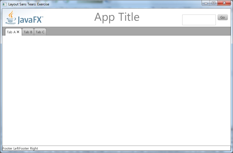
Figure 7:
LayoutSansTearsExercise with Step 2 Partially Completed
By the way, you can use the technique described above to place a vertical spring into a VBox by using the static setVgrow() method of VBox. In addition, the GridPane class has static setHgrow() and setVgrow() methods for use with the GridPane layout.
Now that you’ve addressed the horizontal spacing issues in the header shown in Figure 6, let’s give the search box a margin so that it doesn’t touch the upper right corner.
Setting Margins Around Individual Child Nodes of a Layout Container
The search box shown in Figure 6 is implemented by the code in Listing 5.
    HBox searchBox = HBoxBuilder.create()
      .spacing(5)
      .children(
        TextAreaBuilder.create()
          .prefWidth(120)
          .prefHeight(40)
          .build(),
        ButtonBuilder.create()
          .text("Go")
          .build()
      )
      .build();

    ...code omitted...

            HBoxBuilder.create()
              .children(
                logo,
                headerLeftSpring,
                LabelBuilder.create()
                  .id("app-title")
                  .text("App Title")
                  .build(),
                searchBox
              )
              .build()

    ...code omitted...

    // TO DO: Use a static method of HBox to give the searchBox
    // a margin of 20 pixels on the top and 10 pixels on the right
Listing 5: Setting Margins
There are a couple of ways that our desired padding of 20 pixels on the top and 10 pixels on the right can be implemented in the search box. One way to achieve this in our example application would be to add the padding() method invocation to the HBoxBuilder that creates the search box, as shown in the following snippet:
   HBox searchBox = HBoxBuilder.create()
      .padding(new Insets(20, 10, 0, 0))
      ...code omitted...
      .build()
Another more generally applicable way to implement a margin around a child node of a layout container is to use the static setMargin() method of its layout class. To implement this in our example, go ahead and add the following line where indicated in Listing 5.
HBox.setMargin(searchBox, new Insets(20, 10, 0, 0));
When you run the application, the search box should now be inset 20 pixels from the top and 10 pixels from the right, as previously shown in Figure 2.
Now that you’ve addressed all the spacing issues in the header, we’ll leverage JavaFX CSS to make the footer have the appearance shown in Figure 2.
Step 3: Leveraging JavaFX CSS to Modify the Layout
A very powerful aspect of JavaFX is the ability to use CSS to dynamically style the nodes, including layout container nodes, in a scene. The footer area shown most recently in Figure 7 is implemented by the code shown in Listing 6 (which is a snippet from Listing 1) as well as the CSS document shown in Listing 7.
    Scene scene = SceneBuilder.create()
      .stylesheets("javafxpert/layoutsanstears/ui/myStyles.css")
      ...code omitted...

            HBoxBuilder.create()
              .id("footer")
              .children(
                new Label("Footer Left"),

                // TO DO: Insert the Region object created to act as a "spring"

                new Label("Footer Right")
              )
              .build()
Listing 6: Snippet from Listing 1
/*
 * myStyles.css - style sheet for LayoutSansTears.java JavaFX layout example
 */

#footer {
  -fx-border-color: grey;
  -fx-border-width: 1;

  /* TO DO: Insert a property and value that will give the interior of
     the layout container a padding of 5 pixels on every side */

}

#app-title {
  -fx-font-size: 40pt;
  -fx-font-weight: normal;
  -fx-text-fill: grey;
}
Listing 7: myStyles.css
Using CSS Style Sheet Properties to Modify the Layout
As shown in Listing 6, a style sheet is associated with our JavaFX application by using the stylesheets() method of the SceneBuilder class.
The HBox that contains the labels in the footer leverages the style properties and values from the #footer selector in Listing 7 through the use of the id() method in the HBoxBuilder. Because of this, the HBox is rendered with the border color and width specified in the #footer selector, as shown most recently in Figure 7.
As demonstrated previously, there are multiple ways to put margins around child nodes in a layout container. The technique we’ll use for the footer involves modifying the style sheet by adding the following line in the #footer selector where indicated in Listing 7:
-fx-padding: 5;
The –fx-padding property causes the interior of the layout container to be padded in its interior by 5 pixels on its top, right, bottom, and left sides. Alternatively, four space-separated values can be supplied if you want these padding values to be different from each other.
Go ahead and implement the padding modification, and while you’re at it, take care of the one remaining loose end: implementing a spring between the two labels in the footer. Just follow the same approach as when you implemented a spring in the header.
Running the LayoutSansTearsExercise project should now result in the same appearance as running the LayoutSansTearsSolution project shown in Figure 2.
Conclusion
JavaFX has very powerful features for laying out a user interface, some of which we’ve discussed in this article and demonstrated in the LayoutSansTearsSolution application. These features enable your applications to appear the way you want them to appear, regardless of the size of the scene or the type of platform. Understanding the behavior of each type of layout class, as well as concepts such as clamped versus unbounded nodes, will go a long way toward helping you make the UI appear exactly the way you want it.
See Also
About the Author
Jim Weaver is an independent Java and JavaFX developer, author, and speaker with a passion for helping rich-client Java and JavaFX become preferred technologies for new application development.
Books that Jim has authored include Inside Java, Beginning J2EE, and Pro JavaFX Platform, with the latter being updated to cover JavaFX 2.0. His professional background includes 15 years as a Systems Architect at EDS and the same number of years as an independent developer and software development company owner. Jim is an international speaker at software technology conferences, including presenting at the JavaOne 2011 conferences in San Francisco and S?o Paulo and keynoting at the O’Reilly OSCON/Java 2011 conference in Portland, Oregon.
Jim blogs at http://javafxpert.com, tweets @javafxpert, and can be reached at jim.weaver[at]javafxpert.com.